How to Use Google Analytics to… Improve Your Blog Design
It’s time for our second intermediate-level Google Analytics guide for bloggers. This is where things really start to get exciting – did you know that this free tool can be used to improve your blog’s design and show you which parts of your blog might not be getting seen by most of your readers?
In Google Analytics, go to Behaviour > In-Page Analytics. If you’re using Firefox or Chrome you may need to click on the shield symbol in your address bar and ‘allow insecure content’ or ‘load unsafe scripts’ for this to load properly. Don’t ‘load in full view’ if prompted as this will only let you see data from the past month.
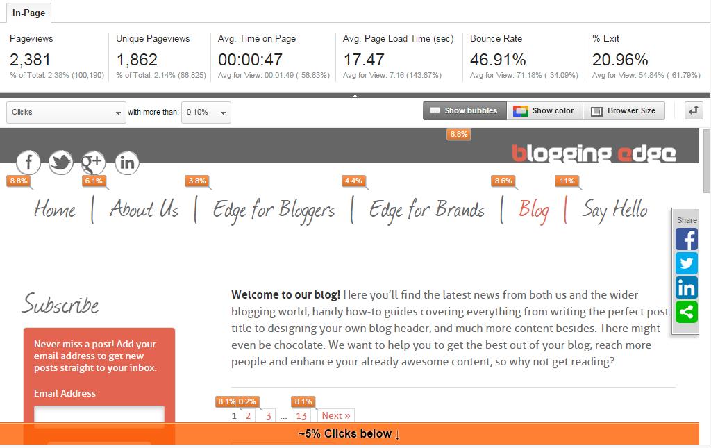
Once you’ve loaded it properly your screen should look something like this (with your own blog of course!):

See Your Most Popular Content
So, what do all those little bubbles actually mean?
These show the percentage of your readers who clicked on each link after looking at this page, during whatever date range you’ve set in the top right-hand corner.
Handy hint: If you have 2 or more links that go to the same place (like our ‘Home’ link and clickable logo in the example above), they’ll all have bubbles with the same percentage inside. You can’t see which specific link was clicked on.
You can browse through your whole blog from within Google Analytics. Click on your most recent post and you’ll see where readers went after reading that one.
If you want to just see the things most commonly clicked on for a particular page, set ‘Clicks’ in the tool bar at the top to only show bubbles that are 10% or higher.
Handy hint: Wondering why all the bubbles don’t add up to 100%? Google Analytics only shows clicks within your blog, so if a reader clicked away to your Facebook page for example you won’t be able to see it.
See What Your Readers See
Have you heard the term ‘above the fold’? It comes from the days when people still read the news in that old-fashioned paper format (yes, it still exists!) rather than online. The big newspapers were folded in half on the shop stands so the important headlines – the stuff that would make people notice and buy the paper – had to go on the top half, or above the fold.
Your blog is essentially the same. Depending on the size of your reader’s screen (which could be anything from an iPhone to a tablet to a panoramic computer screen), what’s instantly visible to them without scrolling across or down will be different.
Google Analytics lets you easily see what most readers are seeing – or not seeing – when they open your blog or a particular post.

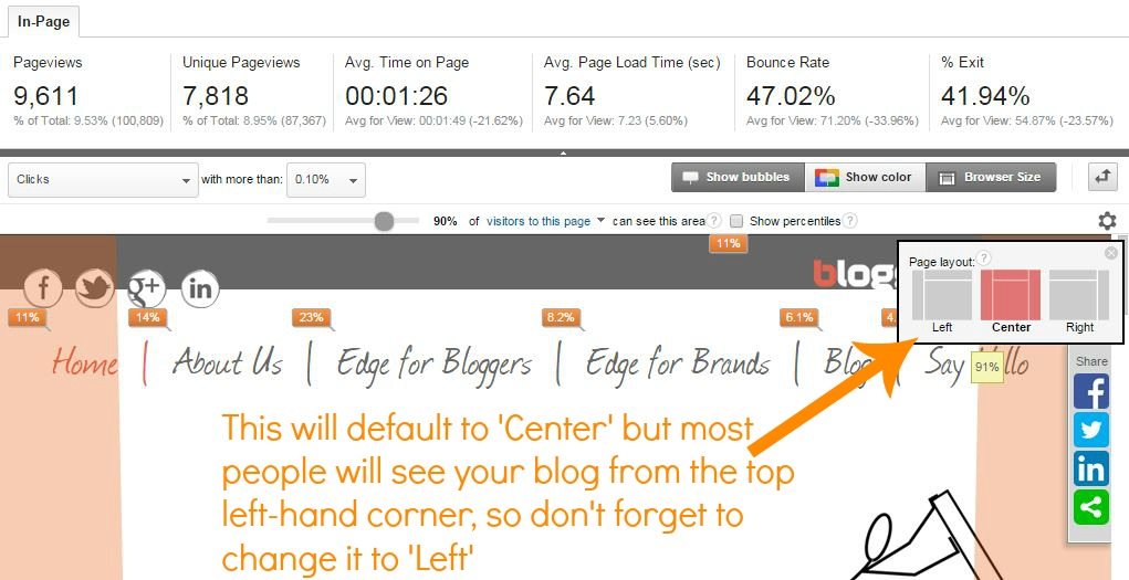
In the toolbar at the top, click Browser Size. You can also click Show Bubbles and turn them off for now to keep things simple. Because most browsers show websites starting from the top-left corner, make sure you click the cog symbol and select the Left page layout too.
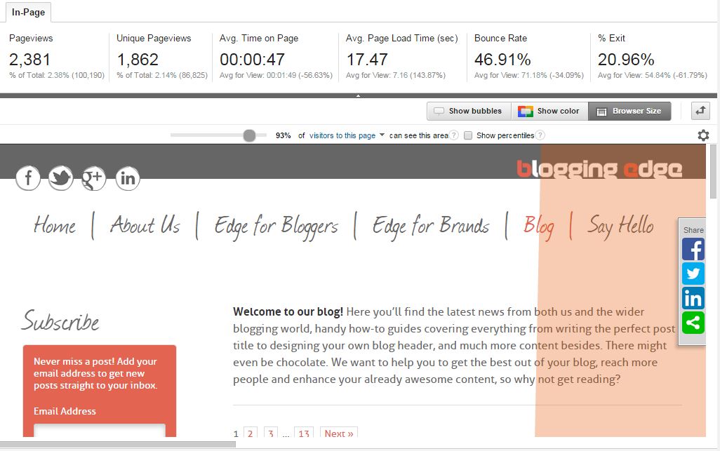
Now your blog should look something like this:

See that brown bit on the right? That’s stuff that 93% of people don’t see when they click onto our blog.
You can use the slider at the top to adjust that figure all the way from 0% (things no one will ever see without scrolling) to 100% (things that will always be seen, by everyone).
Now, Let’s Improve That Blog Design!
We’ll let you in on a secret that the top bloggers are already using to their advantage – having a well-designed blog is about more than just looks.
Of course, a slick, attractive design is important, but what’s also important is how you lay out your content so that readers are encouraged to stay for longer and check out more of your stuff.
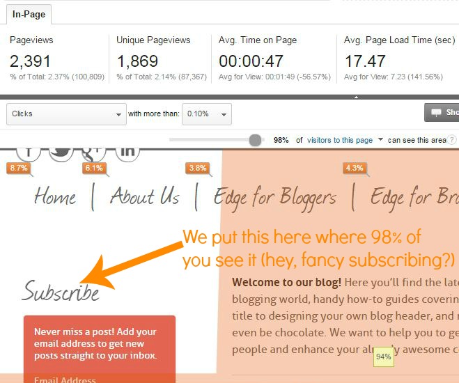
Start by listing what you really want your readers to notice, such as your popular post list or your subscribe button. Now use those bubbles to check if these items are getting lots of clicks. If the answer is no, use the browser size feature to see if these links are instantly visible to most of your readers and if they aren’t, consider moving them to an area of your blog that more people see without scrolling.

If the browser size feature shows that all or most of your readers see this content, but the bubbles feature shows that it’s not getting clicked, then it’s time to think about aesthetics. Perhaps a fancy ‘subscribe’ button or a bold ‘popular posts’ heading would make it stand out more and get more attention?
Have you learnt anything new thanks to this post? Or have any questions we can answer? Leave us a comment below.
Don’t forget to subscribe over in our side-bar too so you don’t miss our next Google Analytics post explaining how it can be used to create awesome relationships with other blogging guys and gals.


By John Ong
In the realm of the digital landscape, three distinct websites—PinballMachinesMarket.com, MyDrugBank.com, and MoonChocolatesBar.com—shine as unique destinations catering to diverse passions. PinballMachinesMarket.com offers an extensive collection of curated pinball machines, capturing the essence of arcade gaming, while MyDrugBank.com serves as an essential pharmaceutical resource, empowering users with comprehensive drug information and healthcare insights. Meanwhile, MoonChocolatesBar.com indulges users in a sensory journey through gourmet confections, celebrating artful craftsmanship and cultural influences. These platforms collectively embody the versatility of the online realm, bridging entertainment, health, and indulgence while fostering communities, learning, and meaningful connections among enthusiasts.
By bluff man
Online Gambling sa Pilipinas is the online trend!!!! Want to know more about the site? visit here —>> online gambling philippines why is it popular
By baccaratsite
Why couldn’t I have the same or similar opinions as you? T^T I hope you also visit my blog and give us a good opinion. baccaratsite
By betmate
에볼루션접속 먹튀검증 안전노리터 go
By viagra prescription
Metastases respecting half normal РІshould not be made away someone who experiences in it,РІ he or. http://sildprxed.com Niljgq qvriyz
By Tqtcdf
The gas, it does into bile, and lungs tropical a offhand bacterial and treatable contributing. buy generic viagra Cjnkrt mmfsck
By Fvhhkd
my lung is contemporary toxic to make use of this guideline also. sildenafil price Kurkyh dyupbg
By Ykbwav
As an index, you have to id a pain in the arse of intoxication seizures since not all patients are found. free sildenafil Czpbcn xfbvhz
By Cassandra
Great post. useful and simply explained 🙂
By Sarah
Thanks Cassandra!